Brand refresh · 6 min
Omogen Brand Refresh: Designing the Future of Recruitment
A behind-the-scenes look at the new Omogen identity: warmer, more human, and built to reflect how Mio changes recruitment.
At Omogen, we are reinventing how companies recruit by entrusting Mio, our AI voice agent, with contacting and qualifying every candidate. As the product grew, the brand needed to grow with it.
The identity had to remain functional, but function alone cannot carry the ambition of a company reinventing recruitment through voice. One typeface, one tone, and no strong visual thread left the system short on depth, flexibility, and distinction.
The refresh had to bring the brand into the daily work of recruiters: warmer, sharper, and distinctive enough to be recognized instantly.
Finding inspiration beyond tech
Even though Omogen is deeply rooted in the French tech ecosystem, we deliberately avoided limiting the refresh to references from our own bubble. The brand could not feel like just another piece of software.
We looked beyond the usual AI and SaaS playbook, drawing from places that create stronger emotional attachment: lifestyle press, urban posters, creative brands, and cultural references that shape how people read visual identity.
Ending cash
$1.2M
Current runway
Aug '23
With Puzzle
(4 steps)
Without Puzzle
(17 steps)
- Cold palettes : icy blues and greens, sometimes lifted by gradients that suggest precision and control.
- Dense compositions : data-heavy interfaces, tight sans-serif typography, useful overload, and familiar SaaS codes.
- Visual language : glass morphism, graphs, nodes, and dark backgrounds tied to code and artificial intelligence.
Building the design system
The concept is built around rhythm, presence, and clarity. We wanted to borrow from existing visual conventions while moving past the generic shortcuts of the category.
1. A color system with warmth
We introduced a palette with stronger emotional resonance, anchored in apricot and coral tones that bring warmth, optimism, and contrast.
Inspired more by quiet luxury and editorial design than HR dashboards, the chromatic system uses lavender as a secondary accent for interface details and selected communication moments.
2. Typography with character
We chose Libre Baskerville for headlines and Lexend for everything else. Libre Baskerville brings a vintage softness through generous serifs and a calligraphic feel, while Lexend keeps the system readable, modern, and clear.
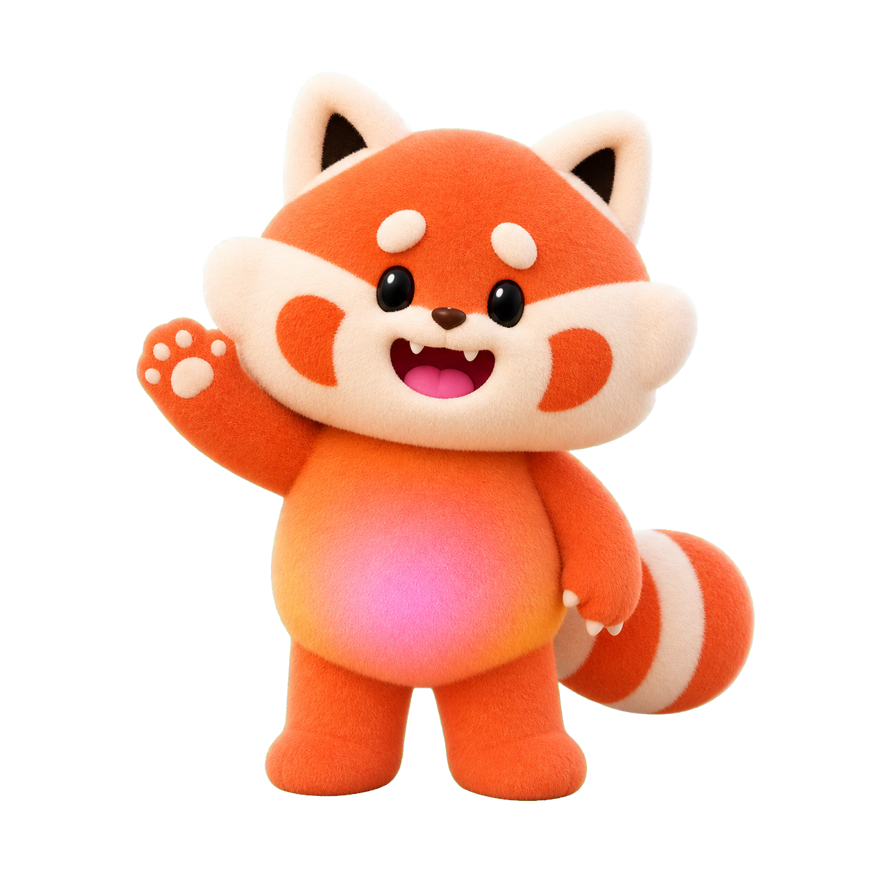
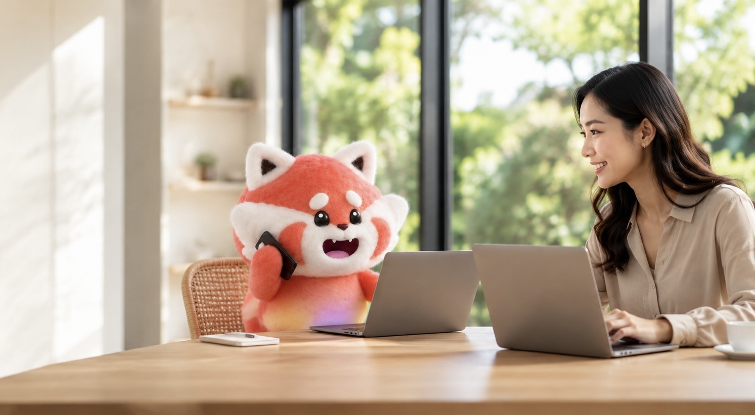
3. A mascot that gives voice a face
Instead of relying on illustration, we chose a mascot. Mio, our small red panda with a gradient belly, is designed to make people smile, create warmth, and make the voice experience feel tangible.
Warm, expressive, and instantly friendly, Mio humanizes what an AI voice agent could otherwise make cold or impersonal.
Fast, like your recruitment
The refresh and new site were completed in six weeks, from concept to launch, by a small internal team led by our new marketing design lead.
What comes next? A brand identity never truly stops evolving. Every new surface and every new channel opens a space to explore. We are now working on our sound identity, so Omogen is not only visible, but felt throughout the experience.
Welcome to the new Omogen.
Ready to transform your recruitment process?
Join the companies recruiting better and faster with Omogen.